A strong visual identity goes far beyond a logo—it is a strategic system that governs how a brand communicates visually across every platform and touchpoint. Consistency in typography, color, layout, and imagery fosters recognition, builds trust, and enhances memorability, transforming design into a tangible business asset.
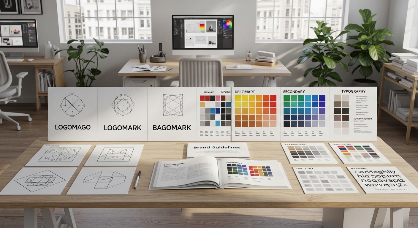
A comprehensive visual identity system includes typography hierarchies, color palettes, grid structures, iconography, photography style, and motion guidelines. Each component is carefully crafted to align with the brand’s personality, values, and messaging. When these elements operate in harmony, they create a cohesive framework that is scalable across print, digital, and environmental design. This ensures that whether a customer interacts with a website, social media post, or physical packaging, the brand experience feels unified and purposeful.
Designing effective identity systems requires a balance between flexibility and structure. Overly rigid systems can stifle creativity and make the brand feel static, while too much flexibility risks inconsistency. Modular frameworks allow brands to evolve visually while maintaining coherence, supporting campaigns, seasonal content, and new product lines without diluting recognition.
In competitive markets, clarity and consistency become strategic advantages. Brands that maintain disciplined visual identity systems across all touchpoints create stronger emotional connections with their audiences. Each interaction reinforces the brand promise, strengthens positioning, and communicates reliability. A thoughtfully designed visual identity does more than look appealing—it amplifies business outcomes, fosters loyalty, and differentiates the brand in a crowded landscape.
Ultimately, investing in a structured visual identity system is an investment in long-term brand equity. By aligning design, strategy, and communication, companies transform aesthetic elements into tools for engagement, trust, and sustainable growth.