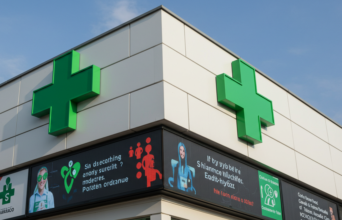
For over a century, the green cross has stood as a universal emblem of care, trust, and healing. It required no translation, no explanation. Today, that symbol is evolving—not by abandoning its heritage, but by embracing light. Modern pharmacy facades now feature LED crosses that retain their iconic shape while gaining new dimensions of function and expression. These are not mere replacements for neon tubes; they are dynamic beacons calibrated for both day and night visibility. By daylight, they display operating hours or vaccination reminders in crisp, readable fonts. After dark, they glow with a soft, unwavering green that cuts through urban haze without glare. The technology is deliberately restrained: single or double-sided configurations ensure visibility from approaching vehicles or pedestrians, while architectural integration allows the cross to complement—never overpower—the building’s design. Some units even support brief audio messages for emergency services or public health alerts. What makes this evolution profound is its respect for context. Unlike flashy retail displays, pharmacy LEDs prioritize clarity, calm, and reliability. They understand that their audience is not browsing; they are seeking. In moments of urgency or uncertainty, the last thing needed is visual noise. Instead, these digital crosses offer quiet reassurance—a luminous promise that help is near. They prove that even the oldest symbols can find new relevance through thoughtful technology, not by shouting louder, but by speaking more clearly.